
A new logo
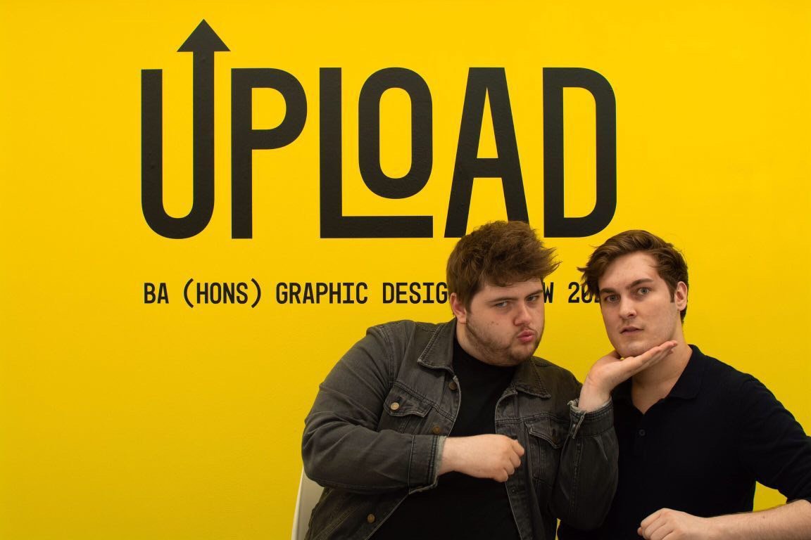
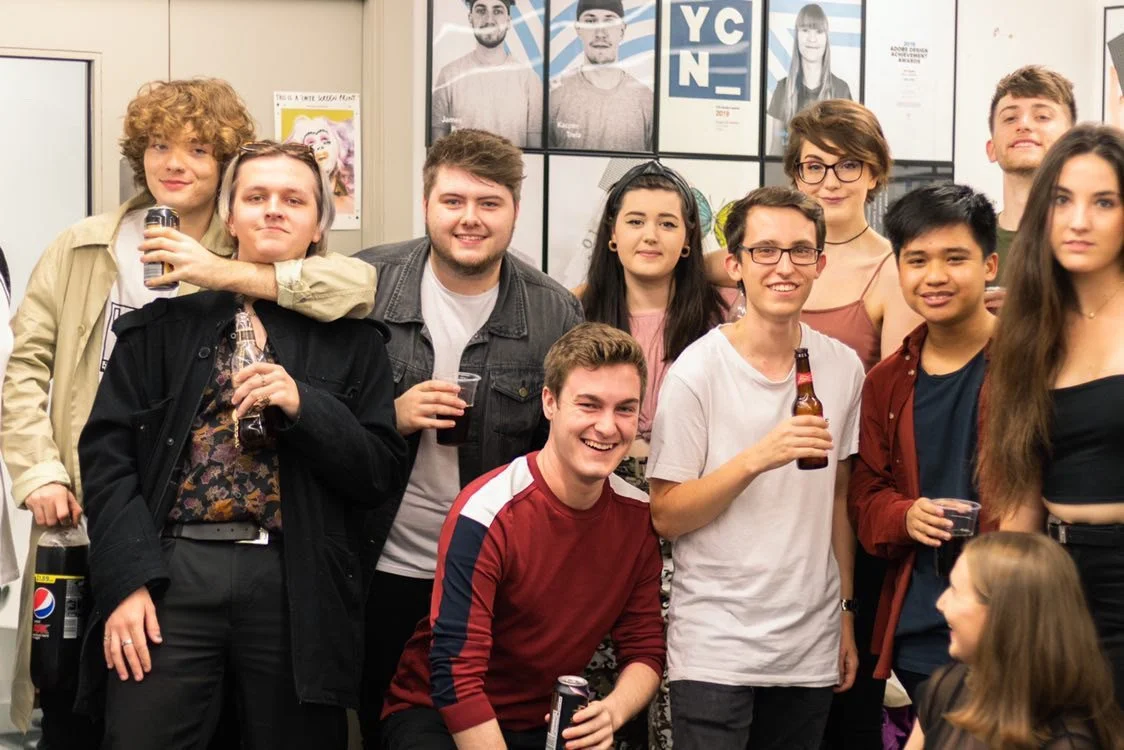
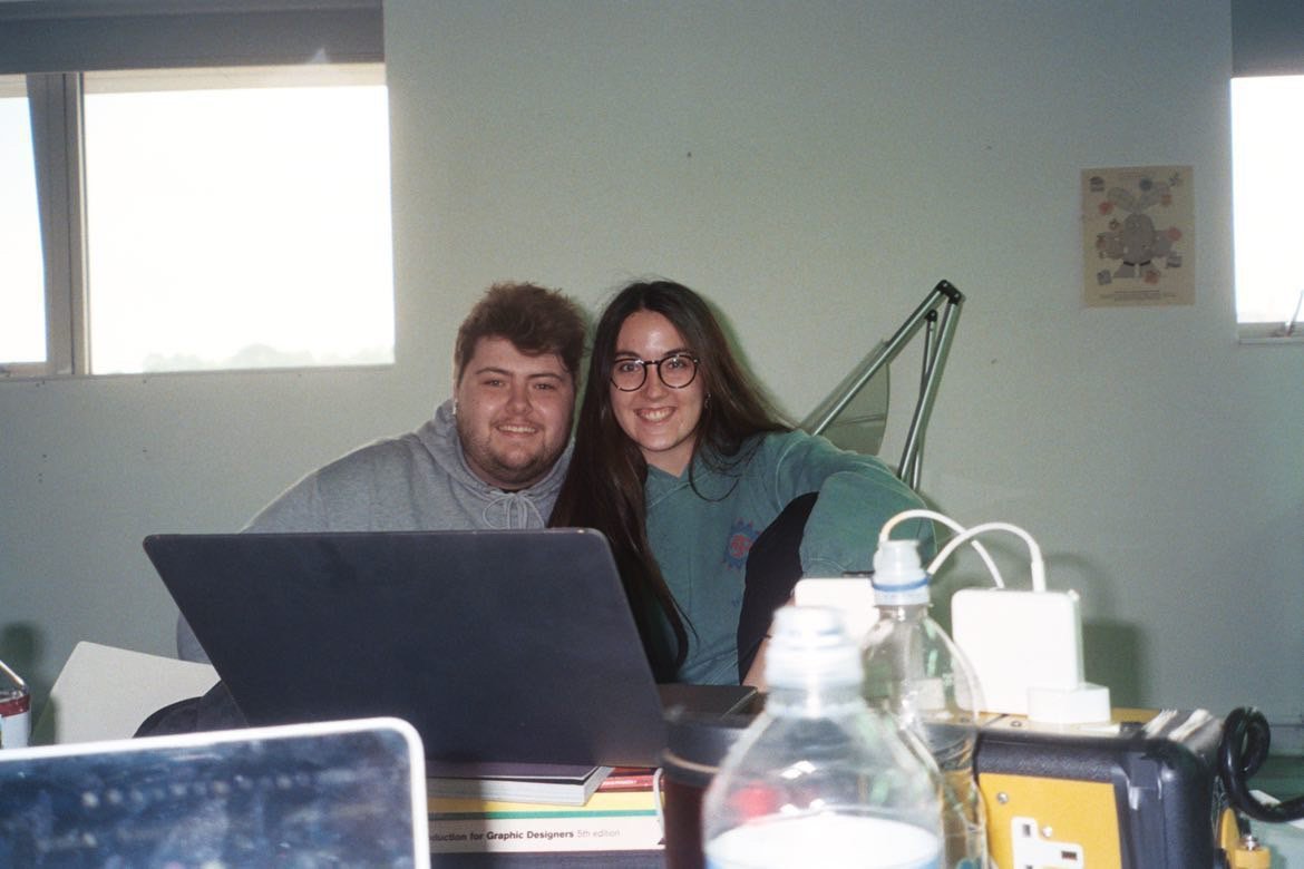
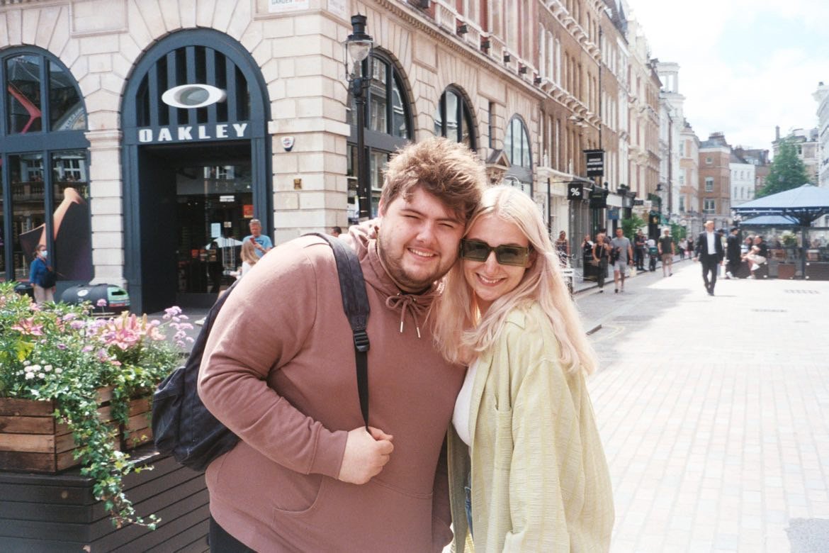
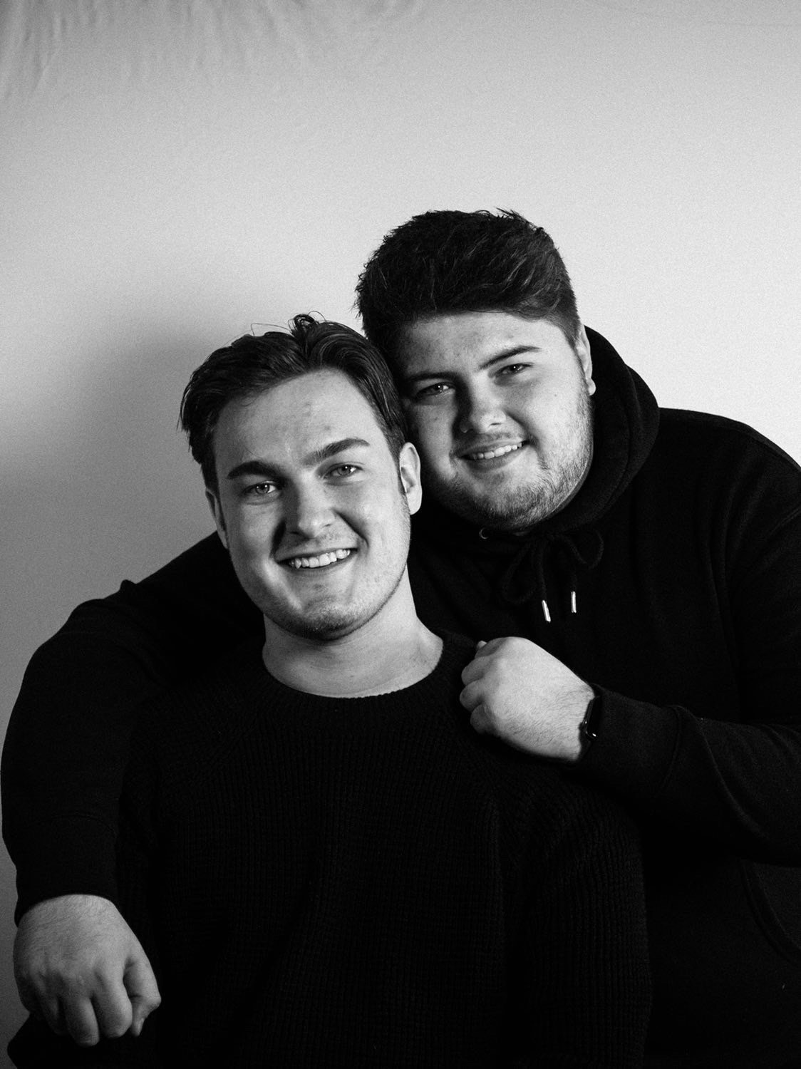
Cam was a popular member of the Graphic Design course at the University of Lincoln, and his inner circle were incredibly close; supporting each other throughout their time at university.

L-R, Back: Jack, Josh, Cam, Andrew; Front: Annika (Nik), Ellie, Lu
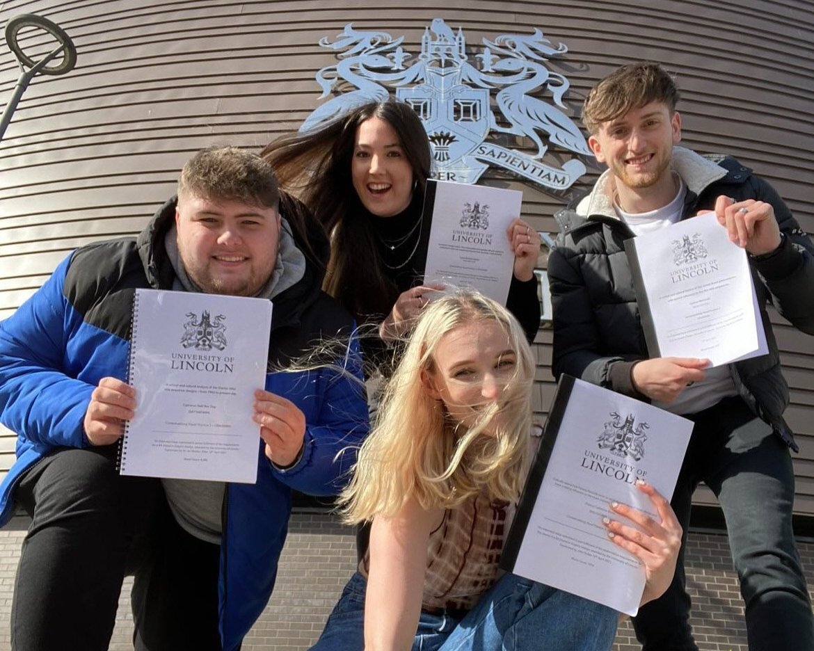
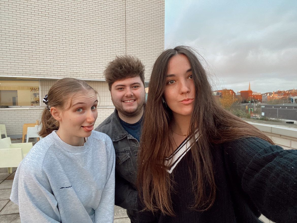
Just after he died, one of his friends Ellie said that they would all pick up the baton for Cam – making him proud through what they achieved, and that he would live on through them. Lu, Josh, Ellie, Annika, and Andrew together designed Cam’s Order of Service, chose the music that we all entered and exited to during his funeral, and are all finding their feet in the design industry – making him proud everyday. They were the clear choice for The CDCT logo, which his family wanted to be inspired by Cam’s personal branding.

The final logo is responsive – at its smallest size it becomes his original logo. The main logo has stripes through the D, which hold the name of the charity. The stripes symbolise steps, slats of a bridge or rungs of a ladder – which represent the mission of the charity: to support and help. The logo features one of his favourite typefaces – Poppins, and the colour palette of black, white, red and grey were Cam’s go-to colours.
Thank you so much to Cam’s dream team for their help, and for everything they continue do to make their friend proud.